How can I write interesting articles about a boring topic?

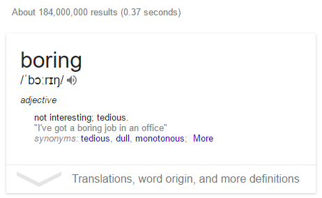
All this talk about writing content that dazzles and astounds is great... but my software is boring with a capital B! It's hard to write interesting content about
$boring_topic$.
Chris Pietschmann said it best:
Games are Cool but Boring Software Runs the World
Fun software does not pay. There is such an over-supply of "fun" software (games, social networks) that people can get it for free. If you're interested in making money selling a product, "boring" is definitely the way to go.
But when it comes to writing valuable content, this presents a robust challenge. You intend to write in an engaging way, but with honesty. It feels like some topics just can't be jazzed up, no matter how many XKCD cartoons you include.
In this rundown, I'm going to focus on simple surface tricks that will give you 80% of the effect for 20% of the effort. There are much deeper concepts that will take you further, but I think these easy wins are worth running through as a first approximation.
For deeper concepts, turn to a professional such as Joanna Wiebe from Copy Hackers:
"The less exciting your product is, the more personality your copy needs"@copyhackers discusses how.https://t.co/eSH2hKx8IU pic.twitter.com/p8z0lgcPPn
— Business of Software (@bosconference) November 9, 2016
Personas
Here's what I know about cryptography. There are two people "Alice and Bob". And they're into some pretty messed up shit.
Once upon a time, in a very frustrating meeting, I was trying to explain a concept to a client and no matter what I tried, he just didn't understand. I tried speaking slower, rephrasing things in numerous ways, drawing diagrams on the whiteboard, nothing was getting through to him. Finally, in exasperation I said:
Do I need to break out the hand puppets??
The customer, this tough nut, with a mind like a lead box, cracked up laughing! So I went with it. I used my hands as puppets, acting out the scenario. And it got through! I connected, and managed to get the neurons inside his fat head to actually start firing!
So I suggest you break out the hand puppets occasionally.
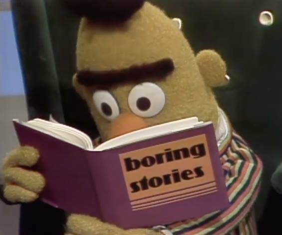
In practice, this can mean inventing personas: "Jeremy is an over-worked sysadmin" — or even anthropomorphizing an inhuman concept: "Dale is a troubled soul: he is a CSV document with a mix of line separators. 'How did I get this way?' asks Dale." It can also mean re-packaging a concept through the use of metaphor or in other creative ways.
There are many excellent examples in the tech world of people teaching programming with simple cartoons. The one you should check out immediately is Julia Evans. If you don't love Julia's work then we can't be friends, I'm sorry, that's just how it is.
PAIN!
Bring the pain. Make the pain explicit.
Describe a painful, horrible situation, in graphic detail, which your reader understands. If that doesn't hook 'em in, they are dead inside and nothing will work.
Skim Friendly
All the usability studies show it... people don't read they SKIM. So make sure your content is skim-ready, with headings-HEADINGS-headings... in a logical structure that will make sense to a skimming reader.
Illustrations!
Your boring article on a boring topic can be jazzed up with illustrations, for example.
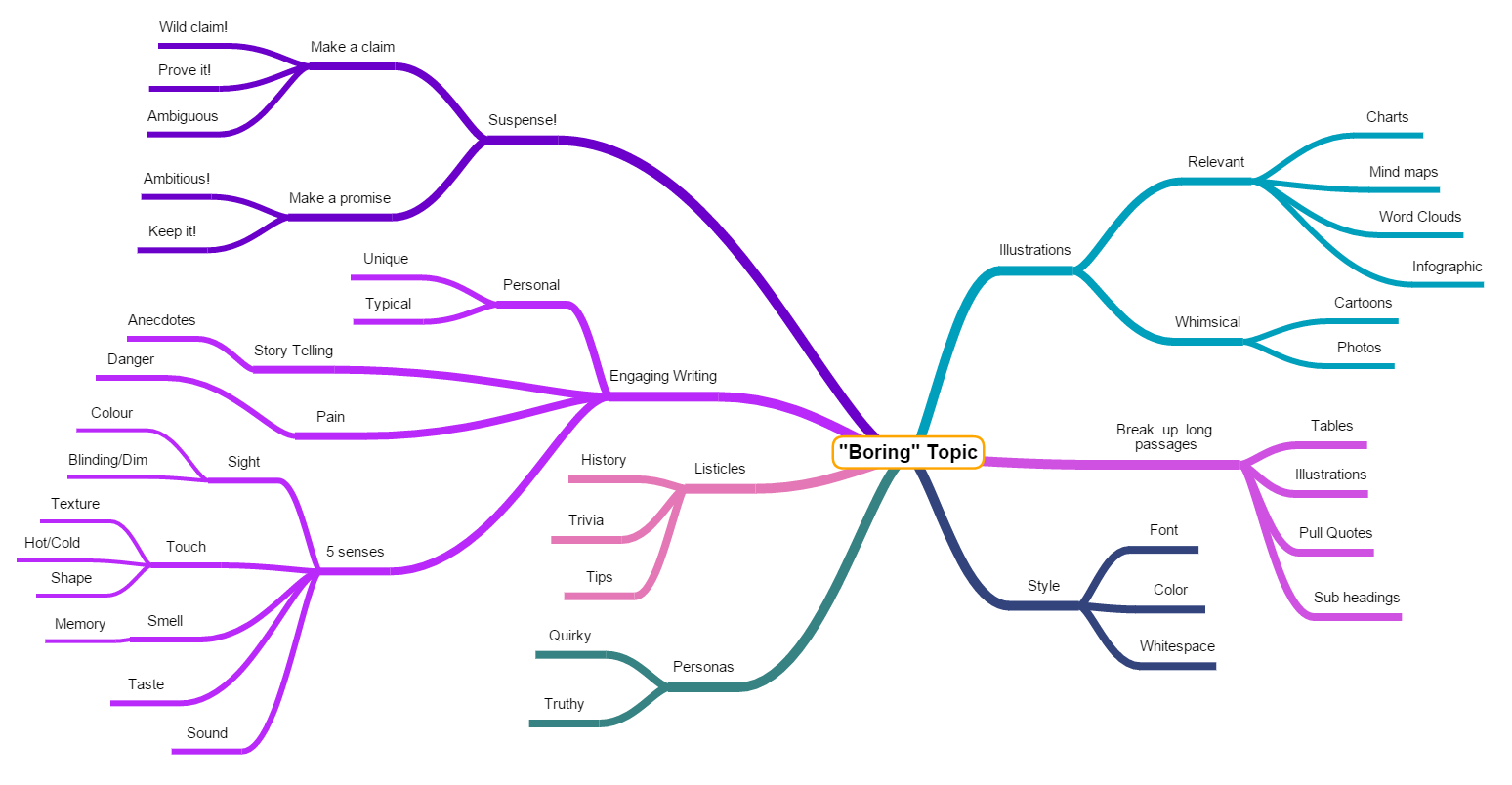 I started to make a mind map on the topic and soon got overwhelmed with just how many things there are you can do!
Illustrations can be whimsical, strictly relevant, or anywhere in between.
You can turn words into illustrations, for example by creating flow charts. Use ASCII Flow to make a flow chart and then use http://shaky.github.bushong.net/ to turn it into a graphic.
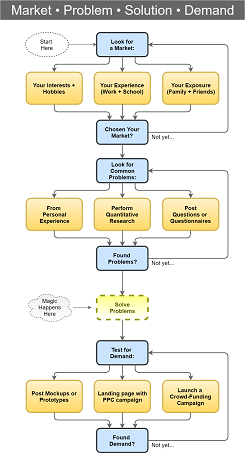
Or to express that plan in a flow chart:

There are also numerous sites online you can use for making more formal looking flowcharts. My favorite is draw.io which lets you draw elaborate diagrams and export them as PNG, SVG or PDF.
Here's one I prepared earlier:
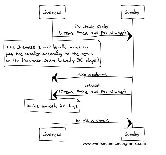
Web Sequence Diagrams can be created quickly, using a simple text format, and displayed in a variety of style. I like this sketchy looking style:
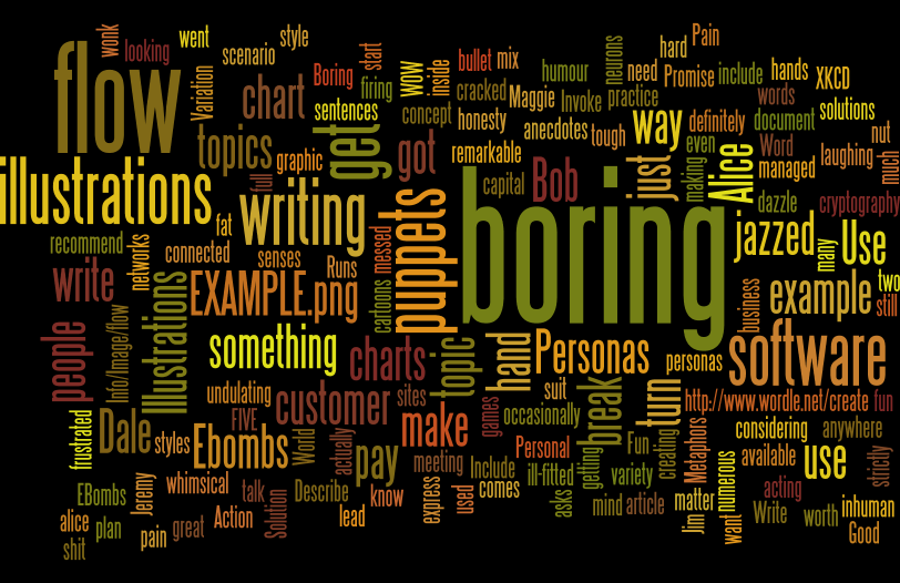
Consider the Word Cloud
"Word clouds" are horribly overdone, but the variety of different styles available still make them worth considering, at least as a last resort.
The most popular "word cloud" creation software is 'wordle', which uses Java. It was created by Jonathan Feinberg who is very clever. His word clouds are far more beautiful than those created by any competitor.
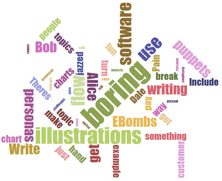
There are also pure javascript solutions, such as Jason Davies' WordCloud
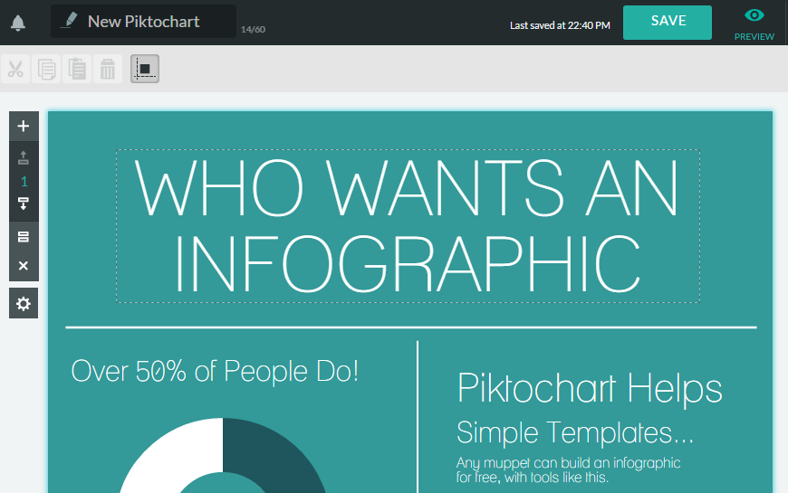
Infographics!
2015 was the year of the infographic. Just as Wordle was over-used in 2010, so infographics were over-used in 2015.
But the positive side-effect of this over-use is that there is now an abundance of online tools that let anyone create infographics, with very little effort, in a short amount of time. If you can sketch it on paper, you can build it into an infographic: few design skills necessary!
I've investigated a whole bunch of these tools and noticed that they almost all require sign up before letting you use their tools. The one I liked best was 'Piktochart' so I can happily recommend it. (I am not affiliated with them or receive any kickback).
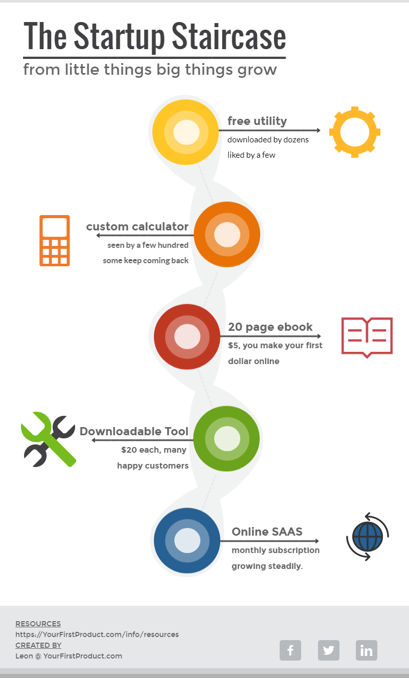
Visme is also fun. I used it to create this shareable graphic:
Graphs
You can demonstrate the complex relationships between items by writing many boring words, or by including a simple graph diagram.
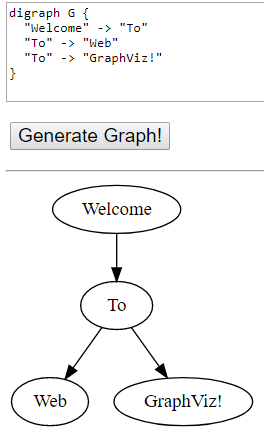
If you have the open source 'graphviz' package installed on your machine, you can generate such diagrams at the command line. Or you can generate them online using a site such as webgraphviz.com
There are certainly prettier ways to present a directed graph, but this is a decent starting point and let's you quickly tinker with different structures to get your point across.
The Listicle
Even worse than the over-use of the infographic, was the over-use of the "listicle". But it works. It will always work.
When you lead with "7 ways to Spice Up Your Dull Content" you've hooked in a very ancient part of the reader's attention.
You've created a tension in their mind, "7?" they ask, "What are these 7 ways? I must know them all! I must see them!". So strong is the desire to answer the question that they will leap over many click-blocks to get to that conclusion.
Ascii Fonts
Here's a simple and somewhat novel way to make a heading or a few words stand out: ASCII-fonts!
For example:
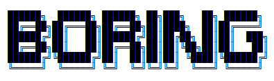
At http://patorjk.com/software/taag/ there are hundreds of Ascii-fonts to choose from, and if you use the "Test all" button you can see them all in action.
Stock photos

So overdone, yet not done enough! You can use stock photos in an ironic way, or you can tap into the latest era of stock photos, typified by Unsplash. Unsplash give you 10 new and interesting free-for-any-use images, every single day.
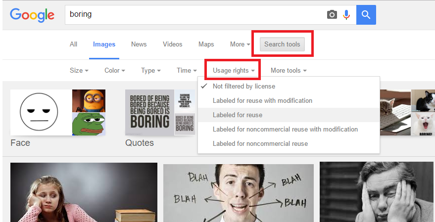
You can also use Google's image search, with "Usage rights" set to "Labeled for reuse" and find all sorts of interesting images.
There is a gigantic curated list of stock image sources here:
Hand-drawn
Nothing beats the authenticity of a hand-drawn image. Even just hand drawn words can serve as an interesting graphic and add impact. Sometimes even worse is better.
Hmmm. Perhaps I can illustrate this notion of impact with a punchy and awesome pictorial representation.

So easy, so effective.
In Extreme Cases
There's never been a more powerful example of using illustrations to draw the reader into a text than this epic masterpiece:
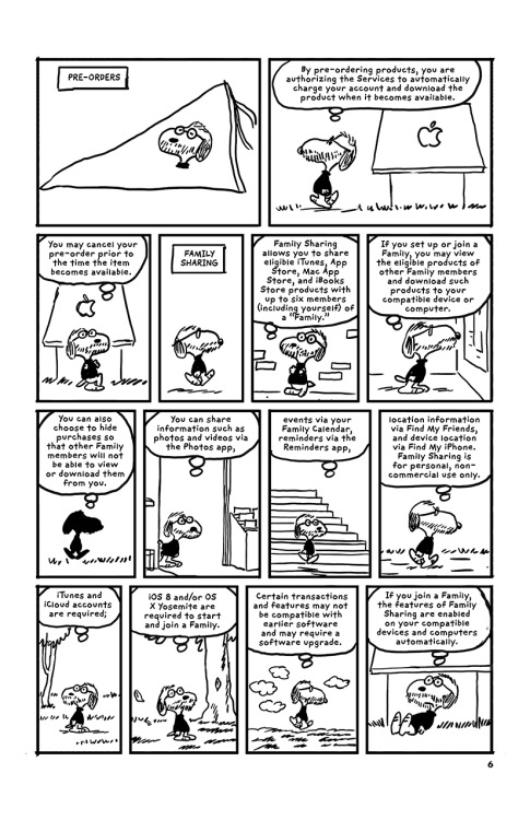
Artist r.sikoryak provided a complete illustrated re-telling of all 96 pages of Apple's T&Cs in the style of famous cartoons (more info). You don't have to aim quite so high.
In Summary
There is a wide range of techniques you can use to add sparkle to a boring article. Readers don't read they skim. So make your boring topic extra friendly and engaging for the skimming reader.
There are no boring topics, just boring articles. Add color. Break up your text. Bring the pain. Make it personal. Enliven your writing. And illustrate the heck out of it.
My book "Choose Your First Product" is available now.
It gives you 4 easy steps to find and validate a humble product idea.